
Average wheat yields
21st October 2016Defra has recently published its preliminary estimate of this year’s UK cereals and oilseed rape harvest. It suggests that wheat averaged 7.9 t/ha and oilseed rape a lowly 3.1 t/ha. Defra, like everyone else, has suggested that the wheat yield was ‘average’. That got me thinking; how is the average yield calculated, particularly if there is a current trend upwards or downwards?
Hence, I have produced two graphs of the average yields of wheat, using information from the excellent online FAOSTAT3 database for the years 1996-2014 and Defra data for 2015 and 2016. The data used by the FAO is taken from Defra’s final yield surveys but at the moment it covers only individual years up to the 2014 harvest.
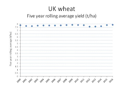
The first graph shows the five year rolling average yield for UK wheat; hence, the 2016 average yield includes the yields achieved from 2012 to 2016. As you can see, this graph rather deflates the view that we are witnessing a breakthrough in yields. Average five year rolling yields have been virtually the same over this century.
The second graph shows the four year rolling average and this implies a different scenario. After a long plateau in yields, they appear to be on the rise following a recent dip.
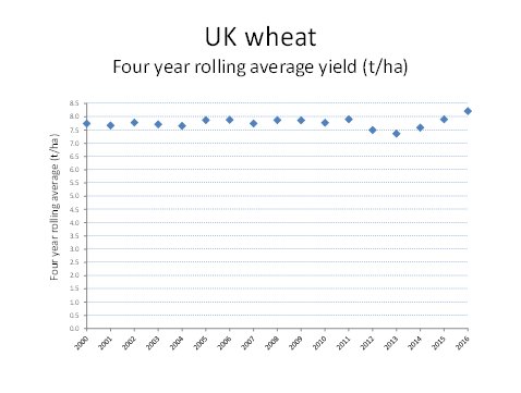
What explains the difference between the two graphs is the year 2012. Taking that out of the picture, the high yields achieved in 2014 and 2015 have raised the 2016 four year rolling average yield. It is tempting to say that we should ignore the poor yields in 2012 where exceptionally low summer solar radiation and summer waterlogging resulted in such poor yields. However, on the same basis, should we perhaps ignore the near perfect conditions, particularly up North, for wheat yields in 2015?
So, in my opinion, we have yet to see clear evidence that wheat yields are increasing despite some spectacular results in 2015. In addition, this year’s oilseed rape yields have dampened a recent trend towards higher yields.
There is more than one reason for the rather ‘average’ yields for this year’s winter wheat yields and the poor winter oilseed rape yields. However, one common feature shared by both crops is that much of the country had poor levels of solar radiation in late May and June. This may have been more significant in winter oilseed rape than in winter wheat. This is because grain fill in oilseed rape is determined almost entirely by current solar radiation whilst a significant proportion of grain fill in wheat is provided by reserves laid down before flowering.
The generally low radiation levels in June are probably the dominant explanation for the relatively high protein levels in wheat this year. Grain fill was restricted whilst moist soils meant that there was adequate nitrogen in the wheat plants. Another explanation may be that farmers were mistakenly encouraged by the high yields in 2015 to apply more nitrogen in 2016. There is no evidence of a link between economic optimum nitrogen levels and feed wheat yields unless yields are exceptionally high. NIAB TAG data suggests that extra nitrogen may be required for yields above 14 t/ha but please remember that such yields occur in parts of fields that have an overall yield of 11-12 t/ha.
Defra publishes its final yield estimates in December along with regional yields. I will then comment on my predictions of wheat yields made in a blog in July. It sounds as if I was not too far out but, of course, the majority of seasons produce average or near average yields.